Il Mio — Social Content Planning
Objective:
Create a cohesive social presence for Il Mio that reflected the restaurant’s warmth, authenticity, and modern Italian charm.
Create a cohesive social presence for Il Mio that reflected the restaurant’s warmth, authenticity, and modern Italian charm.
Approach:
Designed a series of branded quote posts using soft, earthy tones and playful typography to highlight Il Mio’s approachable yet refined identity. The visuals balanced consistency with variety, giving the brand reusable content that felt fresh and on-theme.
Designed a series of branded quote posts using soft, earthy tones and playful typography to highlight Il Mio’s approachable yet refined identity. The visuals balanced consistency with variety, giving the brand reusable content that felt fresh and on-theme.
Result:
Helped strengthen Il Mio’s online presence with a recognizable, lifestyle-driven aesthetic that encouraged engagement and brand loyalty.
Helped strengthen Il Mio’s online presence with a recognizable, lifestyle-driven aesthetic that encouraged engagement and brand loyalty.
LYLA — Corporate Branding & Visual Communication
Objective:
Create branded marketing materials that simplify complex corporate wellness messaging and strengthen LYLA’s communication with clients and employees.
Create branded marketing materials that simplify complex corporate wellness messaging and strengthen LYLA’s communication with clients and employees.
Approach:
Designed a series of print and digital assets for campaigns addressing employee well-being, including The Great Resignation initiative and internal “Back on Site” announcements. Each piece emphasized hierarchy, clarity, and LYLA’s approachable visual language through a bright, modern palette and structured layouts.
Designed a series of print and digital assets for campaigns addressing employee well-being, including The Great Resignation initiative and internal “Back on Site” announcements. Each piece emphasized hierarchy, clarity, and LYLA’s approachable visual language through a bright, modern palette and structured layouts.
Result:
Delivered cohesive campaign materials that increased engagement, reinforced LYLA’s brand reliability, and supported company-wide wellness initiatives through clear, human-centered design.
Delivered cohesive campaign materials that increased engagement, reinforced LYLA’s brand reliability, and supported company-wide wellness initiatives through clear, human-centered design.
Tavern on the Point — Community Event Branding
Objective:
Promote Tavern on the Point’s partnership with Saint Patrick High School through a cohesive visual campaign for their annual community block party.
Promote Tavern on the Point’s partnership with Saint Patrick High School through a cohesive visual campaign for their annual community block party.
Approach:
Created a bright, energetic design system featuring Tavern’s branding alongside school colors and event details. Each layout was adapted for print and digital formats to maintain consistency across posters, flyers, and social posts. The bold imagery and layered typography were used to capture the festive, local spirit of the event while keeping information easy to digest.
Created a bright, energetic design system featuring Tavern’s branding alongside school colors and event details. Each layout was adapted for print and digital formats to maintain consistency across posters, flyers, and social posts. The bold imagery and layered typography were used to capture the festive, local spirit of the event while keeping information easy to digest.
Result:
Delivered a unified campaign that boosted community engagement and strengthened Tavern on the Point’s connection to local audiences through approachable, family-friendly design.
Delivered a unified campaign that boosted community engagement and strengthened Tavern on the Point’s connection to local audiences through approachable, family-friendly design.
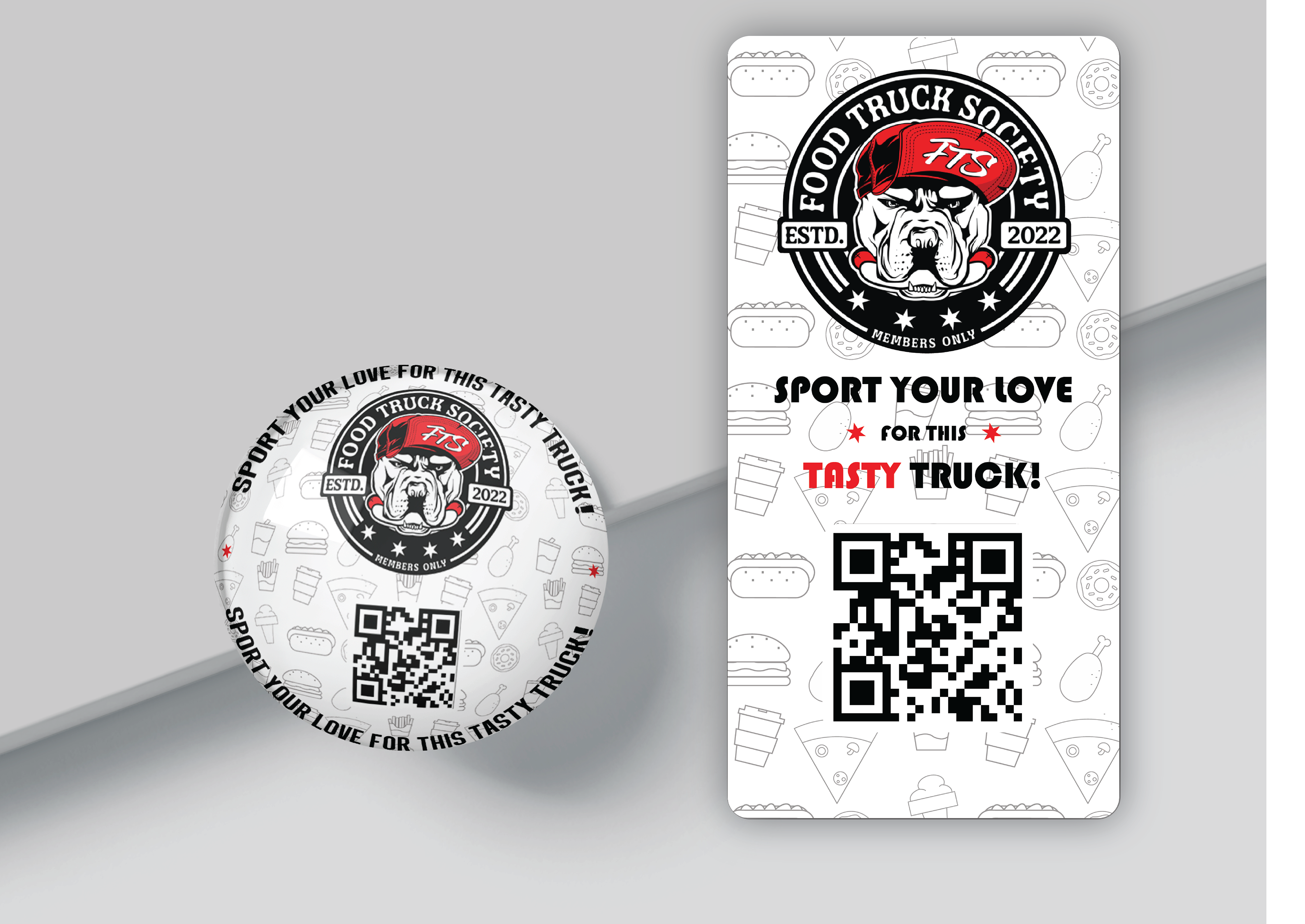
Food Truck Society — Promotional Magnet Designs
Objective:
Design a playful yet bold set of branded magnets to promote Food Truck Society’s street food collective. The goal was to capture the brand’s energetic personality while keeping the visuals clean, legible, and print-ready for small-scale merchandise.
Design a playful yet bold set of branded magnets to promote Food Truck Society’s street food collective. The goal was to capture the brand’s energetic personality while keeping the visuals clean, legible, and print-ready for small-scale merchandise.
Approach:
I created two cohesive magnet designs — circular and rectangular — featuring the brand’s mascot and tagline, paired with a scannable QR code for quick engagement.
I created two cohesive magnet designs — circular and rectangular — featuring the brand’s mascot and tagline, paired with a scannable QR code for quick engagement.
Result:
The final mockups convey the magnets’ physical realism and high-quality finish, suitable for both print production and digital presentation. The design reflects consistency across multiple formats while maintaining Food Truck Society’s bold and approachable aesthetic.
The final mockups convey the magnets’ physical realism and high-quality finish, suitable for both print production and digital presentation. The design reflects consistency across multiple formats while maintaining Food Truck Society’s bold and approachable aesthetic.